Data Correlation
for Marketers
Understanding how data sets relate to each other is one of the most powerful tools in a marketer's arsenal. Here's how correlation analysis drives smarter decisions.
When two data sets move together in a predictable pattern, that relationship is called correlation. It reveals trends, uncovers hidden connections, and — when applied correctly — gives marketers a serious edge in understanding their audience.
At BriteWire, correlation analysis is foundational to how we validate data sources, shape content strategy, and make recommendations that are grounded in evidence rather than assumption.
What Correlation Actually Means
When two sets of data are strongly linked, we say they have a high correlation. The classic example is height and weight in human populations: taller people tend to weigh more, and the data reflects that consistently. One variable is dependent on the other.
In marketing, the same principle applies to behavioral data. Search activity, content engagement, social signals, and purchase patterns all leave footprints that, when analyzed together, reveal how your audience actually thinks and moves.
Step One: Validating Your Data
Before drawing any conclusions, you need to trust your data. BriteWire validates data sources by cross-referencing them against known public values. If a data set correlates with independently verified figures, it earns confidence.
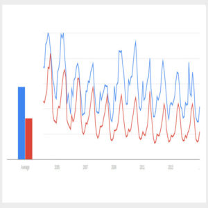
The chart below (figure 1) shows visitor interest in Yellowstone National Park plotted against Glacier National Park over time. Both parks publish annual visitation statistics, giving us a reliable benchmark to test against.

The data matches the published record: Yellowstone draws more visitors, both parks peak in summer, and the relative difference between them is reflected accurately in the search data. Validation confirmed.
Reading Correlation Strength with Scatter Plots
A scatter plot is the clearest way to visualize how strongly two data sets are related. The tighter the data points cluster around a diagonal line, the stronger the correlation.
Figure 2 plots web search activity for Yellowstone against Glacier. The result is a strong positive correlation — users researching one park are consistently researching the other.

This makes geographic sense: both parks are in Montana, and many travelers plan to visit both in a single trip. But the data confirms what might otherwise be an assumption, and that confirmation changes how you act on it.
Content Grouping & Cross-Promotion
When two topics show strong correlation, group them in your content strategy. Cross-link articles, create bundled guides, and build campaigns that address both interests simultaneously.
Product & Package Development
Correlated interest signals are a direct input into product strategy. A tour operator seeing strong Yellowstone–Glacier correlation has data-backed justification to build a combined travel package.
Social & Buzz Monitoring
Correlation analysis applied to social signals and buzz data can reveal which topics are gaining momentum together — giving you an early-warning system for emerging audience interests.
What a Weak Correlation Looks Like
Not every comparison produces a meaningful signal. Figure 3 plots web search activity for Yellowstone National Park against searches for Katy Perry. The scatter plot is diffuse, with no discernible pattern.

That result is as useful as a strong one. It confirms these audiences don't overlap in any meaningful way, which rules out certain targeting strategies and keeps your marketing budget focused on relationships that actually exist.
Validate the Data Source
Cross-reference the data set against known public values. If correlation holds, the source is reliable enough to build on.
Map Audience Relationships
Identify which topics, behaviors, and search patterns move together. Strong correlations indicate overlapping audience intent.
Translate Signals into Strategy
Use confirmed correlations to inform content grouping, campaign targeting, product development, and social strategy.
Discard Weak Relationships
Weak correlations are valuable too — they prevent wasted effort on audience segments that don't actually connect.
The Bottom Line
Correlation analysis turns raw behavioral data into actionable intelligence. It validates what you think you know, surfaces connections you didn't expect, and gives every marketing decision a factual foundation.
The examples here are intentionally simple. In practice, BriteWire applies these methods to search data, social signals, content performance, and buzz monitoring across complex, multi-channel campaigns.
The marketers who win aren't the ones with the most data. They're the ones who understand what their data is actually saying.
BriteWire is a data-driven digital studio based in Bozeman, Montana. Visitation figures referenced from the National Parks Service annual reports.