Why Home Page
Carousels Don't Work
The data has been clear for years. Image sliders and carousels on home pages produce poor engagement, and our own internal tests confirm it. Here's what the numbers actually say.
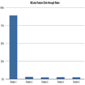
Image sliders and carousels are one of the most common home page design patterns on the web. They are also one of the least effective. Analytics data from multiple sources tells the same story: visitors largely ignore them.
The most widely cited evidence comes from the University of Notre Dame, where developer Erik Runyon published interaction data from the ND.edu homepage carousel. The numbers are stark.
The Notre Dame Data
Runyon's study analyzed over 3.7 million homepage visits and tracked how users interacted with the featured marketing banner carousel. Of all visitors, only 1.07% clicked on any slide at all. Of that small fraction, nearly nine in ten clicked the first slide — the one visible on load without any interaction.
Every subsequent slide received a fraction of even that limited attention. The data makes a compelling case: users do not scroll carousels, and content placed beyond the first slide is functionally invisible to almost everyone.
Slide-by-Slide Breakdown
The drop-off across slides is not gradual — it is immediate and severe. The second slide received just 3.1% of total carousel clicks. Slides three through five each captured roughly 2 to 3%. For practical purposes, any content placed in slides two through five reached almost no one.
Slide 1 — 89.1% of clicks
The only slide most users ever see. Everything placed here receives the vast majority of what little carousel engagement exists.
Slides 2 through 5 — 10.9% combined
Each subsequent slide captured between 2.4% and 3.1% of total clicks. Content placed here is effectively hidden from almost all visitors.
What the Experts Say
"Carousels are effective at being able to tell people in Marketing/Senior Management that their content is on the home page."
Since Runyon published his findings, a broad consensus has formed among UX practitioners against homepage carousels. Luke Wroblewski — Product Director at Google, former CPO at Bagcheck, Chief Design Architect at Yahoo, and author of Mobile First and Web Form Design — has been among the most prominent voices confirming the pattern.
The core problem is not the technology. It is how people read web pages. Users arrive with a specific intent and scan for the most relevant element. An auto-advancing banner that cycles through unrelated messages works against that behavior at every step.
Fresh, Frequently Updated Content
News sites and editorial properties that update carousel content daily see meaningfully higher engagement than static marketing banners.
User-Initiated Interaction
Carousels that require a deliberate click to advance — rather than auto-advancing — tend to generate more intentional engagement from visitors who choose to explore.
Tightly Related Content
When every slide serves the same audience intent — a product gallery, a portfolio series — users are more likely to advance through the sequence.
The Bottom Line
If you are running a carousel on your homepage, add click tracking now if it is not already in place. Measure the actual engagement rate against each slide. In most cases, the data will confirm what the research already shows.
The decision to use a carousel is often made for internal political reasons — multiple stakeholders each want their message on the home page. That is an organizational problem, not a design solution. A single, clear, well-crafted hero message will outperform a rotating banner in almost every context.
If nearly every visitor ignores everything after the first slide, you do not have a carousel. You have a static banner with a lot of wasted effort behind it.
Every element on a homepage should earn its place. That conviction drives BriteWire’s conversion-focused web design — if it doesn’t help users act, it doesn’t ship.
Sources: erikrunyon.com — Carousel Interaction Stats · shouldiuseacarousel.com