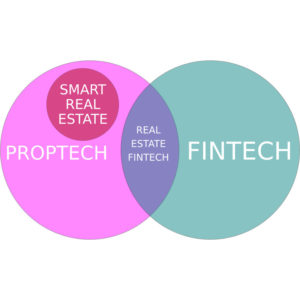
PropTech Disrupting The Real Estate Industry

Real Estate is the largest and most valuable asset class in the world but the Real Estate industry is ripe for disruption. Traditional real estate brokerages are under increasing competitive pressure as technology companies make inroads into the previously walled off real estate market. This complex, multi-faceted and high-stakes industry is rapidly becoming one of the hottest markets for entrepreneurs and investors alike.

Proptech - Fintech

PropTech(short for Property Technology) refers to the sector of startups and new technologies cropping up in response to decades of inefficiencies and antiquated processes in the real estate industry. The term is being used to encapsulate the entire market space of technology and real estate coming together to disrupt the traditional real estate model. PropTech is also referred to as CREtech (Commercial Real Estate Technology) or REtech (Real Estate Technology).

The PropTech sector is generating increased buzz as more people realize the opportunities for innovation in this sector, and venture capital investments expand. Real estate tech startups around the globe raised $1.7 billion worth of investments in 2015 – that’s an 821% increase in funding compared to 2011’s total. PropTech companies have raised around $6.4 billion in funding from 2012 to 2016. It is difficult to pin down exact numbers, but it is estimated that investment in the space increased by 40% for 2016. Compass, Homelink, SMS Assist and OpenDoor Labs all saw their valuations increase to over $1 billion in 2016.

Internet technology has tremendous potential to improve transparency and efficiency in real estate transactions. Property Listings and Property Search was the initial area for improvement. Over the past several years, technology advancements in property search and listing engines have been introduced.

These advancements allow home buyers to more easily find their home by making search criteria easier to specify. Buyers can specify the obvious search criteria like price range, size, number of bedrooms, and location. Additional facets of navigation like lot size, water features, adjacent public land, conservation easements, and if horses are allowed can also be used as search criteria. Buyers can view maps of where the homes for sale are located, and find homes for sale using maps as their primary search navigation tool. Search criteria can be saved in property search engines so that when new homes come on the market that match a buyer’s predefined criteria they are automatically notified.

Advancements on property listings have allowed a listing to easily be syndicated to hundreds of websites with the click of a mouse. This dramatically expands the listing’s exposure to potential buyers.

Technological advancements in deep learning, AI and other big data technologies are driving significant innovation in all areas of the property technology sector. Advancements in video, 3D Modeling, and virtual reality are allowing buyers to virtually tour homes they are interested in. These advancements allow agents to more effectively showcase the properties they are selling. However, these advancements in moving key data to the Internet may also mitigate the role that real estate agents play in the real estate process.

Competition in the space is increasing, but many tech companies do not have access to the industry and associated data due to real estate laws and regulations on disclosure. In many states it is illegal to disclose the price of a real estate transaction, and only members of the local real estate MLS have access to all the listing information.

What is next? Investor confidence is high and reports are that a massive amount of investment capital will be pumped into the real estate sector. It is safe to assume that we will see significant changes in the technical landscape for the real estate market.


Home Page Image Sliders(aka Carousels) Are Not Effective

Websites frequently use Image Sliders or Carousels on their home page. Website Analytics data from numerous sources indicate that this is a poor tool for presenting content on the home page. Our own internal tests correlate with the data from the other sources.

The most frequently cited study on slide carousels was on the data provided by Erik Runyon for the University of Notre Dame’s website. This data shows that only 1.07% of visitors clicked on slides in the featured marketing banner carousel.

I am including that data here for convenience. The link to the full study can be found at the bottom of this page.

Stats from ND.edu

  • Homepage visits: 3,755,297
  • Percentage that clicked a slide in the home page carousel: 1.07%

Percentage of total clicks for each slide:

  • Slide 1: 89.1%
  • Slide 2: 3.1%
  • Slide 3: 2.4%
  • Slide 4: 2.8%
  • Slide 5: 2.6%

Home Page Sliders Are Not Effective

The data shows that of the 1.07% of users that clicked on the slides, 89.1% simply clicked on the first slide. Slides beyond the initial view had a dramatic decrease in visitor interaction.

Since the publication of that data, numerous experts have chimed in confirming that Slide Carousels on the home page are not effective including Luke Wroblewski. At the time of this article Luke is a Product Director at Google. Previously he was the CEO and Co-founder of Polar, (acquired by Google in 2014) and the Chief Product Officer and Co-Founder of Bagcheck (acquired by Twitter in 2011), the Chief Design Architect (VP) at Yahoo!, Lead User Interface Designer at eBay, Senior Interface Designer at NCSA, and the author of three popular Web design books (Mobile First, Web Form Design & Site-Seeing: A Visual Approach to Web Usability) in addition to many articles about digital product design and strategy. He is also a consistently top-rated speaker at conferences and companies around the world, and a Co-founder and former Board member of the Interaction Design Association (IxDA).

It should be pointed out that some users have data that indicates that carousels are more effective than the data we are presenting here, and there is still some debate on just how effective or inneffective carousels are. There appears to be a correlation between the Slide Carousel Click Through Rate and the nature of the content being displayed. The biggest factor effecting this appears to be how FRESH the content is, and how frequently it is updated. Content that is frequently updated with current information will produce better results with sliders and carousels.

If you are currently using a carousel on your website, add tracking codes if they are not already in place and measure the effectiveness of it as an element on the page.

Sources:

http://erikrunyon.com/2013/07/carousel-interaction-stats/

http://shouldiuseacarousel.com/

Category : BriteWire Blog


Social Media Content Half Life

Social media is a time based stream of content. These time-based structures effectively deliver the latest information, but in doing so redefine how we think about the life span of content, and highlight the importance of content engagement in broadening audience reach.

Social Media Content Half Life

The previous generation of content on the web was static and had a relatively long life span. I will use the working term “Archive Content” for this generation. Internet Marketers used Content Marketing as a strategy to attract and retain a clearly-defined audience. The content they create can be used as part of an information archive. The goal was to get that content to rank high in search results for specific search terms. It was, and still is, a very effective Internet Marketing technique.

This type of content could easily be found as soon as it was indexed by the major search engines, and could continue to be found 6 months after it was published, or even years later provided the information was still useful.

Contrast that with social media environments, where stream algorithms determine the order of content appearing in the subscriber streams. In these social media environments user engagement drives content success. As a post generates engagement (likes/retweets/shares) it gets added to additional subscriber’s streams broadening its reach, and generating additional engagement.

Sharing Velocity measures the speed of engagement, and the Half Life Of Social Content measures the length of time that a unit of social media content has reached half of its total number of engagements.

A increasing amount of research is being performed on the half-life of engagement on Social Media. Precise numbers are not possible yet, but estimates are.

Twitter: half of retweets happen within the first 18 minutes.

Facebook: half of reach happen within the first 30 minutes.

Instagram: half of comments happen within the first 2.23 hours.

YouTube: half of views happen within the first 7.4 hours.*

* My experience with YouTube is different, but the content I produce is designed to be useful for a longer period of time. I currently run 5 YouTube channels, and find that I get an initial surge of video views from my existing subscribers, but that over time as the videos continue to get discovered by users that are not subscribers total views substantially exceed the number of views I received in the first 8 hours. I view YouTube as a hybrid of “stream” and “archive”, so the half life of video content will depend on the shelf life of its usefulness.

Comparing earlier data with current data and it is very clear that the total lifespan of social media content along with its half life is getting shorter.

Category : BriteWire Blog


Best Practices for Website Design

Web developers have had to evolve their skill set from designing for a limited number of desktop resolutions to creating flexible websites optimised for all device display resolutions. This article identifies best practices for website design, and provides a resource of popular devices and their display resolutions.

Modern HTML, CSS, and Javascript frameworks like Bootstrap are leading the way for developing responsive, mobile first websites.

The utilize a “grid system” which divides the screen real estate into 12 equal columns. Based on the width of the display in pixels, the framework can determine how many columns to use while displaying the page content.

The best part about the new grid system is that you don’t have to create different versions of your site for different devices. Given the large number of devices listed below, and the numerous screen resolutions, you can realistically design your website to use a different grid on 4 different browser sizes. Below is the breakdown of the different sizes.

.col-xs-$ Extra Small Phones Less than 768px
.col-sm-$ Small Devices Tablets 768px and Up
.col-md-$ Medium Devices Desktops 992px and Up
.col-lg-$ Large Devices Large Desktops 1200px and Up

To ensure websites are built for the best experience on the most devices, it’s important to be aware of the most popular screen sizes and resolutions. The more your website is accessible and easy to use, the more people will be able to view and use it which tranlates to a more positive user experience.

Screen Size vs. Resolution
The screen size is the diagonal measurement of the physical screen in inches, while the resolution is the number of pixels on the screen. The resolution is displayed as width by height (i.e., 1024×768). Also, while desktop and laptop displays are in landscape (wider than tall), many mobile devices can be rotated to show websites in both landscape and portrait (taller than wide) orientations. This means that designers and developers, in some cases, must design for these differences.

Most Popular Screen Resolutions

  • Desktops & Laptops

1024×768 and higher

15-inch Apple MacBook Pro with Retina display: 2880 x 1800 226 ppi

  • Standard Netbook/Tablet Resolution

1024×600

Amazon Kindle Fire
Samsung Galaxy Tab, Galaxy Tab 7.0 Plus & Galaxy Tab 2 7.0
HTC EVO View 4G

  • iPhone

6 Plus: 1920×1080 401 ppi

6: 1334×750 326 ppi

5: 1136×640

4S: 640×960

3GS: 320×480

  • iPad

First & second generations: 1024×768

Third generation: 2048 x 1536 264 ppi

  • iPad Mini

1024×768

  • Android Phones & Tablets

Most phones are 320px wide or 360px wide, and most tablets are 800px wide. When designing for them, however, it is typical for developers to break them into the following groups based on their Density-independent pixel (dp), which is the minimum screen size.

Small screens: 426dp x 320dp

Normal screens: 470dp x 320dp

Large screens: 640dp x 480dp

Extra-large screens: 960dp x 720dp

Category : BriteWire Blog


Why You Should Not Purchase Facebook Likes

It is tempting to purchase “Likes” for your company or organization. The more “Likes” you have, the more legitimate your company appears, and the more your posts will be seen right? Wrong!

You have undoubtedly seen advertising claming to deliver Facebook Likes for your company. I still encounter companies that have either already purchased Facebook Likes, or are considering purchasing Likes from various sources. Here is why this is a bad Marketing move.

When you purchase Facebook Likes for your page critical metrics including Support and Engagement go down. Purchased Likes are either people being paid to “like” accounts, or fake accounts altogether. Either way, these people do not value your company or organization. The Likes you get are from spam or fake accounts, which violates Facebook’s user policy. (This means they can get banned and deleted.)

Facebook uses several algorithms which determine how often your posts appear in your fans’ Newsfeeds. If your content does not generate engagement, then it demotes your content. When you buy Facebook Likes, the percentage of people who engage with your content (which is likely not even everyone who organically liked your page) will shrink.

So, not only is buying Likes a waste of money, it actually harms your ability to reach your true fans.

Here is a video from Veritasium that does a great job explaining fake Likes on Facebook.


Category : BriteWire Blog


How Netflix Uses Image Analysis To Create Visual Content

Producing high-quality original content is expensive, so Netflix analyzes its vast collection of data to increase the odds of creating content that appeals to its subscribers. With subscribers presented with nearly unlimited options, why leave such a potentially critical aspect completely to chance? After all, Netflix possesses the data to make the most informed business decision possible.

In a previous Blog Post we talked about how Netflix is using massive amounts of data to make intelligent decisions on creating original content.

They also perform data analysis on images to gain competitive advantage.

Questions Netflix answers with Visual Image Analysis include:

– Are certain customers trending toward specific types of covers? If so, should personalized recommendations automatically change?

– Which title colors appeal to which customers?

– Is there an ideal cover for an original series? Or should different colors be used for different audiences?

Look at the covers of their original series House of Cards, and the 2010 version of Macbeth that ran on the PBS series Great Performances.

They are very similar in terms of color balance, contrast, and visual field. They both display older white men with blood on their hands(Kevin Spacey and Patrick Stewart). Both images have primarily black backgrounds, and use a very similar color pallet.

Netflix House Of Cards vs Macbeth

The covers of the two shows are much more similar than dissimilar. However, subtle differences do exist between the two images, and Netflix can precisely measure those differences. The next image details how Netflix visually interprets the data from those images.

Netflix Visual Data Analysis

Netflix measures if the similarities and differences have any quantifiable impact on subscriber viewing habits, recommendations, and ratings. Management teams carefully review this data when selecting the covers for their original content series.

What is next? Comparing the visual contrast and hues of images isn’t a one-time experi­ment for Netflix, it is a regular component of their strategy. Netflix recognizes that there is tremendous potential value in these discoveries. To that end, the company has created data analysis tools to unlock that value.

At the Hadoop Summit in 2013, Netflix employees Magnusson and Smith talked about how data on titles, colors, and covers helps Netflix in many ways. For one, analyz­ing colors allows the company to measure the distance between customers. It can also determine, the “average color of titles for each customer in a 216-degree vector over the last N days.”

A great example of a company transforming data into intelligent, game-changing results.

REFERENCES: http://techblog.netflix.com/

Category : BriteWire Blog


How Netflix Uses Big Data To Create Content

Netflix collects an enormous amount of data on its users and their actions, and uses that data in ways never before used in the entertainment industry to decide what content to produce. The numbers are staggering: Netflix is the world’s leading Internet television network with over 57 million members in nearly 50 countries enjoying more than two billion hours of TV shows and movies per month.

Netflix collects an enormous amount of data on its users and their actions, and uses that data in ways never before used in the entertainment industry to decide what content to produce.

The numbers are staggering: Netflix is the world’s leading Internet television network with over 57 million members in nearly 50 countries enjoying more than two billion hours of TV shows and movies per month.

Netflix looks at data generated from over 40 million “plays” a day. It keeps a record of every time subscribers pause the action, rewind, or fast-forward. They track how many subscribers abandon a show entirely after watching for a few minutes. In addition they track the time of day when shows are watched, and on what devices they are watched on.

Netflix user account data provides verified personal information (sex, age, location), as well as preferences (viewing history, bookmarks, Facebook likes).

Having this wealth of detailed knowledge of Netflix subscribers, what they watch, and how they watch it allowed the company take the next step of creating content, but do it using intelligent data driven decisions.

The data collected by Netflix indicated there was a strong interest for a remake of the BBC miniseries House of Cards. These viewers also enjoyed movies by Kevin Spacey, and those directed by David Fincher.

Netflix determined that the overlap of these three areas would make House of Cards a successful entry into original programming.

Venn Diagram - Netflix House Of Cards

The result: House of Cards is the most streamed piece of content in the United States and 40 other countries, according to Netflix. It is rated 9.1/10 from 180,816 users at IMDB.

In any business, the ability to accurately predict what products or services will succeed is of paramount importance and value.

What is next? Correlating the raw numbers of Kevin Spacey fans who also like David Fincher and have a fondness for British political dramas is just the beginning. Netflix’s deep dimensions of data about what you are watching can be used to judge specific aspects of content as well. Senior data scientist Mohammad Sabah reported at a Hadoop Summit conference in 2012 that Netflix was capturing specific screen shots to analyze in-the-moment viewing habits, and that the company was “looking to take into account other characteristics” as well. What could those characteristics be? GigaOm’s report of the Sabah presentation speculated that “it could make a lot of sense to consider things such as volume, colors and scenery that might give valuable signals about what viewers like.”

In the next post I will explore how Netflix uses Data Visualization to make Intelligent Design Decisions.

REFERENCES: http://techblog.netflix.com/

Category : BriteWire Blog


500% Difference In Search Term Performance

The usefulness of keyword marketing intelligence cannot be overstated; with keyword research you can predict shifts in demand, respond to changing market conditions, and produce the products, services, and content that web searchers are actively seeking. However, subtle changes in terms and keywords can make a dramatic difference in performance. In this article we correlate a selection of search terms to reveal a surprising trend in Interest Over Time.

Keyword research is one of the most important, valuable, and high return activities in the field of Internet Marketing. Marketers are familiar with measuring the frequency different terms are searched for in identifying which terms to optimize around. By researching your market’s keyword demand, you can not only learn which terms and phrases to target with SEO, but also learn more about your customers as a whole. Content Marketers use a similar approach in identifying subjects for content, and the titles to use with that content. The idea being that you want to optimize around terms that get searched for frequently, or have the highest interest among your target audience.

We analyzed a collection of 40 search terms for the tourism industry. The collection of terms followed two different patterns. One set all began with the phrase “top 10…”, and the other set all began with the phrase “10 best…”.

The line chart below (figure 1) is the terms correlated with their search frequency over time.

500% increase in search term performance

figure 1

It seems like a minor difference, and you might assume that the terms “top 10” and “10 best” can be used interchangeably.

However, terms beginning with the phrase “top 10” had over 500% more searches than the terms that began with the phrase “10 best”.

This simple example demonstrates how important it is to use data to drive your marketing decisions.

Category : BriteWire Blog


A Primer On Data Correlation for Marketers

BriteWire uses data science to drive intelligent marketing decisions. When making a presentation to a new customer, I like to include a quick primer on Data Correlation to help them understand how powerful it can be in revealing trends, patterns, and characteristics of success for their business.

When two sets of data are strongly linked together we say they have a High Correlation. The classic textbook example used to demonstrate correlated data is height / weight data sets for human beings. The data indicates that a person’s weight is dependent on how tall they are, with shorter people tending to weigh less than taller people.

BriteWire uses correlation in many ways. We first use it to validate data sources. This is done by using known data values to check if they correlate with the data set we are analyzing but have not yet validated. This is best demonstrated using some simple data sets with known public data.

The following chart (figure 1) is a data set that measures visitor interest in Yellowstone National Park correlated with Glacier National Park.

Data Correlation – Validating Data

figure 1

Both of these parks publish Visitation Statistics, so we can use these known values to validate the data set we are working with. Visitors per year to Yellowstone National Park are approximately just over 3 million per year, with visitors to Glacier National Park averaging slightly lower at just over 2 million. Analyzing the published data in more detail reveals that there is seasonality, with the summer months being the period of highest visitation.

Looking at the chart we see that the data set indicates interest in Yellowstone National Park is higher than interest in Glacier National Park, and that interest peaks during the summer months. The data set correlates with the published data from the National Parks.

Scatter Plots are often used to visualize correlated data because they indicate how strong the correlation is. In the next chart (figure 2) web wearch activity for Yellowstone National Park and Glacier National Park are displayed in a scatter plot.

Data Correlation – Strong Correlation

figure 2

The scatter plot in figure 2 is showing a Strong Positive Correlation between Web Search Activity for Yellowstone National Park, and Glacier National Park. A user searching for information on Yellowstone National Park also appears to be searching for information on Glacier National Park. This makes sense because they are both located in the state Montana, and many people are interested in visiting both during their vacation.

As a result, your content marketing strategy should group these two subjects together, and perhaps cross link / cross promote between them. If you are a tour opporator perhaps you create a travel package that includes visiting both parks. These are very basic take-a-ways, but you get the idea.

A week correlation is easy to visualize with a scatter plot. The last chart(figure 3) is the scatter plot for web search activity for Yellowstone National Park and Katy Perry.

Data Correlation – Weak Correlation

figure 3

Not surprisingly the scatter plot indicates a week correlation between these two data sets.

In addition to validating data sets, Data Correlation can be used in many different ways to drive intelligent decisions for marketers, including social marketing strategy, content marketing, and interpreting data sets derived from Buzz Monitoring.

We will explore Data Correlation in greater detail in future articles as we explore these topics and more.

Category : BriteWire Blog


Big Data – Why It Is Important For Marketing

Big data is a term used to describe the exponential growth in the amount of data generated and stored. The analysis of big data will become increasingly important to marketers because it leads to more intelligent decision making.

Big Data MarketingThe software industry has been defined by major shifts or transitions in the technical landscape. Having been in the tech industry for over 25 years, I have been involved with many of these waves. The PC wave, which was followed by the Client Server wave that revolutionized Enterprise Computing. This was followed by the Open Source wave, followed by the rapid rise(and brief collapse) of the Internet wave, Social Networks, and Mobile Computing.

One of the most exciting developments is the rise in Big Data and Cognitive Computing. In the last 2 years humans have generated more data than they have in the history of mankind. To put that in perspective you need to consider that humans have been around for over 200,000 years!

In the last 2 years humans have generated more data than they have in the history of mankind. To put that in perspective you need to consider that humans have been around for over 200,000 years!

Some of this data is being put to good use, but most of it isn’t being used in meaningful ways… yet.

I see a huge opportunity to use all the data and organize it in meaningful ways for data driven decisions, especially when it comes to marketing decisions.

That is the idea behind BriteWire…. Big Data analysis to drive Intelligent Internet Marketing.

BriteWire ingests large amounts of data and analyzes it to reveal trends, patterns, and characteristics of success. Just as important as the vast volume of data being generated is the timeliness of the data. Real time or near time analysis and monitoring of data can provide valuable information about emerging trends. When impending crises are identified you can be alerted before the situation becomes damaging.

In a world in which knowledge is power, what you don’t know can hurt you.

In future blog posts I will be diving into these topics and more. If you are interested in Big Data, Internet Marketing, Brand Development, and Internet Technology then follow along as I explore these topics in greater detail.

I will also be writing articles and posts about Competitive Intelligence, Social Networks, Cloud Computing, Content Marketing, and “Buzz Monitoring”.

Category : BriteWire Blog